When you visit the doctor complaining of a cough or stomach pain, they usually seem to know what to do: They'll ask if you have trouble breathing, or check your heart rate. But it's all a little baffling: What are they checking for? What illnesses could it be? This remarkable new infographic by GE, working with MIT's SENSEable City Lab, peels back how various symptoms of illness are linked, giving you a tantalizing look into the mind of a doctor.
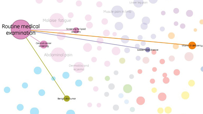
The interactive chart is powered by 7.2 million medical records, gathered between 2005 and 2010. Using these, MIT's data wizards were able to figure out how often one symptom was linked to another. Here, for instance, are the common things that might happen after a routine medical exam:
And here are the symptoms most commonly linked to a cough:

The color coding, as you can guess, indicates the basic category that a symptom falls under. Thus, you can see that coughs are occasionally linked to infections, but more often they're indicative of chronic respiratory problems.
If all that node mapping stuff is confusing, you can also look at the entire chart another way: As a circle with all the symptoms on the outside ring, and links displayed as lines:

You've got to wonder if doctors in the future wouldn't be helped by a tool like this: Sure, their personal experience is important, but why not aid them with a data visualization that shows how likely various sicknesses are, based on the symptoms? Right now, it's mostly a binary decision built on clues: You either have Hodgkin's disease, or you don't. But backing up to the initial medical exam, shouldn't a doctor, upon seeing your swollen lymph nodes, be perfectly aware of how likely all the various diagnoses are? Something like that might turn every doctor into a modern day House, M.D.
Systems like these might also lower medical costs: Doctors routinely screen for farfetched diseases, just to eliminate them as a possibility. If we can make smarter decisions based on likely outcomes, then we should be able to save money as well.
Click here to visit the interactive chart."
Subscribe to:
Post Comments (Atom)