When I was a kid, my family and I would see shows at our town's golden era movie house. It was a small, second-run theater. Its rich decor and the perpetual smell of popcorn oozed of the past in this kind of magical way. My favorite visit was to see Back to the Future. I can remember the juxtaposition of an art deco theater and a time-traveling Delorean like it was yesterday. I was taken back to that moment earlier this year, and again last week, walking around the Museum of Moving Image (MoMI) in New York with a new expansion designed by Leeser Architecture and new identity and signage designed by karlssonwilker. While this project is a few months old, there is not much information out there about it, so I decided to do some digging and gather some of the loose images on this project, most found on this Flickr set by Archidose and this Facebook album from karlssonwilker.


Museum entrance and identity.
Upon approach to the building the museum's logotype, large and imposing, confronts you on mirrored glass. Once inside you are enveloped in angular whiteness and digital projections, the whole thing reminiscent of a cartoon imperial destroyer. The bright colors employed in the environmental lighting, signage, and visual system complement the stark, hard interior. After exploring, you find yourself in dark rooms with interactive media, virtual reality, and movie equipment and memorabilia spanning over a century.

Lobby.

Theater entrance.

Theater.
Originally opened in 1988, the MoMI was the first U.S. museum dedicated to the art, history and technology of film, television and video. Clearly, the museum which reopened its doors earlier this year was not that same institution. The visitor is not only emerged in the past, but also the present and future of the moving image.

Page from type specimen.
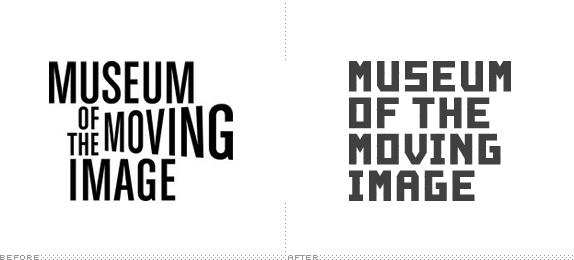
The typeface, designed by Cologne-based Julius Terlinden that creates the Museum's logotype was drawn on a triangular grid inspired by the Museum's new façade. As the core identity element, it seems fitting. The new building's architecture is so memorable, so why fight it? It manages to evoke the golden era of cinema while looking curiously futuristic. It also has a remarkable Saul Bass quality. The typeface is not only used to create the logotype, but employed as a central messaging platform within the museum on signage and used in print materials.

Triangular grid on building exterior.
It's good to note that bespoke typefaces and architectural forms have been employed before for a number of museums and cultural center identity's including MAD, The Museum Boijmans van Beuningen, The DeYoung, The Fort Worth Museum of Science and History, and the Casa da Musica to name a few.


Signage, digital application in interiors.
Online, the MoMI's logotype becomes filled with abstract, slowing moving, imagery. This digital application seems to be less satisfying than one would wish. Given the rigidity of the letterforms, it would be interesting to see it have more movement. As far as a greater visual system, 3D-esque blocks function as containers for photographs, text, and serve as animated buttons. These buttons are emotionally satisfying and highly recognizable as a branded design element, but lose their playfulness after a while. Another graphic element is a spike-like 3D graphic appearing in many different colorful iterations. It is often used in exhibition signage with dynamic, skewed, typographic titles reminiscent of sensational movie titles from the past.


While the identity really comes alive in the space itself, it's less impactful when in basic print materials and web application. Part of me wishes the beauty of large images, cleanliness, and simplicity of white type exhibited in the museum's interior was more prevalent in these other other touchpoints. Nonetheless, the space is where the real experience happens, and what is a brand but an experience.
I used to think of the MoMI as 'that old movie museum' but clearly with their current design and programming they have moved past that. The museum has repositioned itself (as they put it) as an institution that 'advances the public understanding and appreciation of the art, history, technique, and technology of film, television, and digital media', and they seem to be delivering. With this new building and new branding, they've overcome any stigma they might once have had. When you visit, see if you can find a copy of Gray's Sports Almanac.
Joshua Levi is an independent graphic designer living in New York.

Established in 1984 in Barcelona, Mango is an international fashion brand for women and men with fun, friendly, accessible clothing. While they have a small presence in the U.S. they are very well known in Europe. Mango currently operates over 2,000 stores in 105 countries and counts with more than 8,000 employees. I remember there being a store in Mexico City and it used to be geared towards a younger demographic but it seems like they have upped the age range and have introduced a new logo that is aimed at a more mature audience. The new logo was designed in-house.
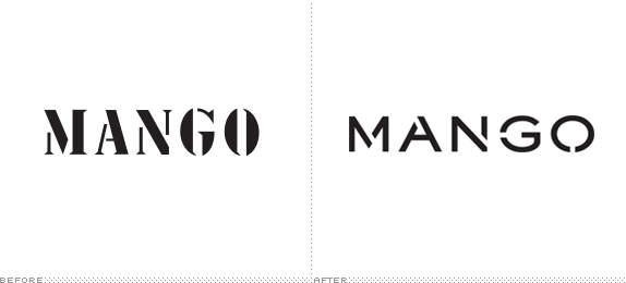
This new logo represents the values of the brand, such as its unique style, originality and femininity, and is adapted to the style of the MANGO woman of today. In order for it to endure over time and not suffer changes in fashion, MANGO has taken the most illustrative aspects of the former logo, based on mecano parts and in which the 'o', for example, was similar to a screw head, taking as a reference a simple, discreet and solid type face.
— Arab News

It's funny how a stencil serif wordmark can be used for both a quirky European fashion brand that can employ Kate Moss as well as for a home improvement store that would never see Kate Moss — or anyone that looks like Kate Moss — in its stores. The previous logo was okay, it benefits from 25 years of equity as well as its association to European fashion but it's really nothing special. The new one isn't either but at least it's a clear evolution from the old one providing a very simple and easy segue into the next however-many-years they go with the new logo. The stencil marks in the new logo are clearer and play much better with the extended letterforms, whereas the old looked squished. The "O" is a little weird, with only one notch, making it look like a bull nose ring. Overall, it's an expected evolution or, in other words, they didn't screw it up too much.

Established in 1973 in Amsterdam, the Van Gogh Museum holds over 200 paintings as well as drawings and letters of Vincent van Gogh. More than 1.5 million people visit every year, making it the most visited museum in the Netherlands and, according to research by The Art Newspaper, it is the 23rd most visited museum in the world. Earlier this month the museum introduced a new identity designed by Amsterdam-based Koeweiden Postma.

The year is 1985. In America, Reagan is in the White House, Michaal Jackson and Lionel Richie are writing 'We Are The World', and Cliff Huxtable is dazzling us with his wardrobe of knit sweaters. In Italy, the country's largest clothing maker, The Benetton Group, coins the phrase 'United Colors of Benetton'. The phrase is blasted into pop culture, not only referencing the company's colorful clothing but also the idea that cultural diversity is good. Today, Benetton colorfully dresses customers in 120 countries and is in the process of rolling out an evolved graphic identity system designed by Pentagram partners Daniel Weil and Michael Bierut with the internal Benetton team.

Established in 2006 with the combination of the former Hughes Software Systems/Flextronics Software Division and frog design (which had been acquired by Flextronics in 2004), Aricent is a 'global innovation and technology services company that helps clients to imagine, commercialize, and evolve products and services for the connected world' with more than 10,000 consultants, designers, and engineers at 36 offices around the world. This past May Aricent announced a new brand positioning — "a provider of innovation services for the connected world" — changed its name to Aricent Group to serve as the parent company for Aricent (delivering the 'communications technology expertise') and frog design (delivering the 'creative vision and user experience prowess'). The new identity has been designed by New York-based Siegel+Gale.

Established in 2010, Design Museum Boston (DMB) is a nonprofit organization that "envisions creative, engaging public art and design education for Boston and New England." Without its own physical space DMB is a nomadic museum — or what they call a "decentralized network of physical and virtual exhibits" — bringing different programming and experiences to galleries, retail environments, and public spaces. Back in January — sorry, sometimes we are out of the loop on things — DMB introduced a new identity designed by Continuum and, to many people's amusement, the design process was thoroughly documented on Core77: Here is a list of posts from nine weeks worth of work and, a highlight from week 5, here are the design concepts shown.
