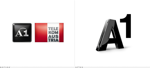
Established in 2010 from the merger of two popular telecommunication providers, A1 and Telekom Austria, A1 Telekom Austria is now the leading service provider in Austria with more than 5 million mobile and 2 million fixed-line subscribers and 9,700 employees. At the end of April they announced that the two consumer brands would merge into a single one under the A1 name and a new identity created by Saffron. A micro site introducing the new identity (with a brief movie) can be found here and a press release (PDF and in German) here.

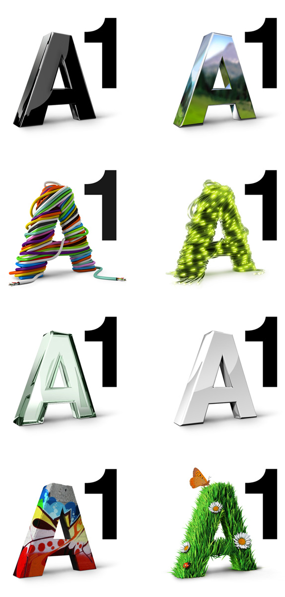
Both previous logos lacked the luster of a consumer brand, looking too serious an un-fun for their own good. If the new logo doesn't lack anything it's certainly luster. Built around a monolithic, black 'A' the logo is a three-dimensional flexible identity that can take on a slew of different skins, whether it's just a change in the materials its made of (from glass to metal) or what its draped in (from cables to grass). As far as flexible identities go this is as basic, and almost needless as it gets. There is no element of surprise, the executions aren't too exciting, and all the concepts feel almost gratuitous. There is a definite boost in the fun factor for the brand but that's only by comparison to the old. The big, bold '1' is nice though.
Thanks to Krzysztof Jeziorny for the tip.
Shared by
roylah
1 comments:
- okmijin said...
-
recently branding like to go this way..quite nice...
- June 7, 2011 at 11:38 PM
Subscribe to:
Post Comments (Atom)