
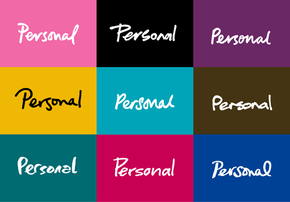
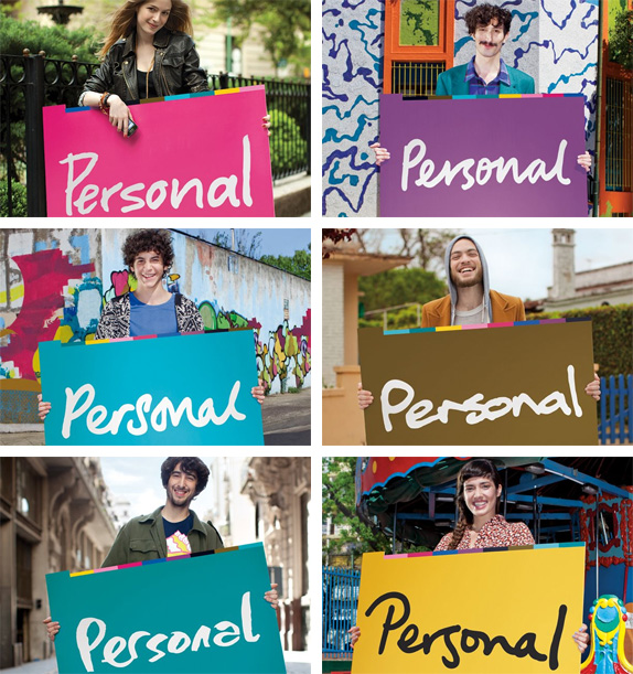
Personal inaugurates a new paradigm by generating an integrated innovative visual identity, unique in the world for a such a large company, composed of multiple logos that celebrates the principal values of the company's strategy: DIVERSITY and FLEXIBILITY. […] The choice of a handwritten signature reinforces this sentiment, there is nothing more personal than one's signature, just like there is nothing more personal than the way each person expresses themselves through the use of their cell phone. It's because of this that Personal's corporate identity rekindles the spirit of Each person is a world and manifests it through a visual system made up of different logos that, far from being a closed system, will keep evolving with the brand.
—Press Release, translated by yours truly
Identity launch. Skip to the 8:00 mark to see the start of the presentation. Continues…
Identity launch continued. The bigger reveal happens in this video.
One of many TV ads by TBWA\Buenos Aires. "We are all different. And it's all good". See more here.
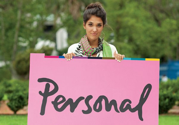
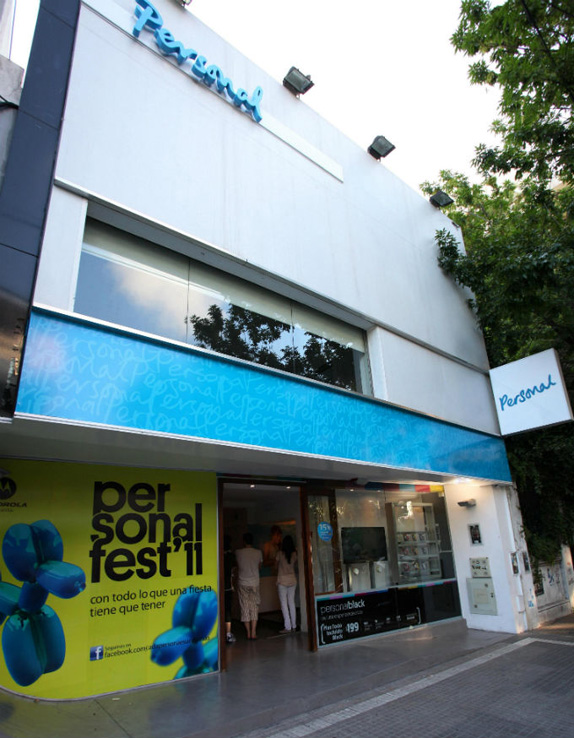
The old logo was simply a derivative of the parent company's logo so, far from being "personal," it looked cold, distant, and like it didn't care what it looked like. The new identity is a complete reversal of that approach through a literally more personal identity based on a cadre of signatures that act as the logo. It's a fun premise, but it's tricky to pull off right as the different handwritings communicate different things and, well, they look different, making it difficult to establish consistency. Personal is attempting to solve this by tying everything with bold and vibrant colors and a peculiar sans serif typeface that is ugly enough to establish a consistent visual language. In the past I have actually pitched this signature approach, so I have preemptively vetted the concept as good (if not viable) and I still think it could be done right. This identity for Personal is a valid attempt, one that plays well with the company's name, but there is a feeling that it is trying too hard to feel "personal" and it just comes across as a big-ass company trying to make friends with the little guy and gal.Thanks to Alberto G. Manuel for the tip.