![]()
Formally established in 1968 but with roots as far back as 1847, the Royal Conservatoire of Scotland (formerly Royal Scottish Academy of Music and Drama) is Scotland's "national centre of professional vocational training in performance arts." RCS offers undergraduate and postgraduate degree programs — in music, Scottish music, acting, musical theatre, modern ballet, and technical production & arts among others — to about 800 students and currently has 873 people on staff, giving it the "highest staff-student ratio of UK Conservatoires, offering intensive one to one tuition." This past September RCS announced its name change and introduced a new identity designed by Glasgow-based Stand.
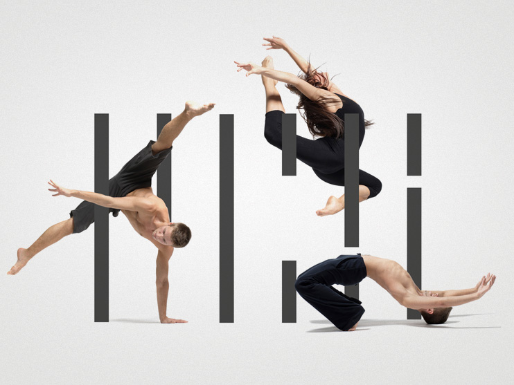
Stand set out to create a marque that captured the variety of courses on offer at the Conservatoire. We started by trying to find a constant — a visual link between the disciplines. We found this link in the visual language of multi-track sequencers. Software such as Logic, Final Cut Pro or GarageBand use multiple lanes of information to capture performances. We immediately caught onto the notion of channels (bass, drums, vocals, video, scripts and scenes) representing the various department disciplines — which all come together to form the overall performance — the Conservatoire.
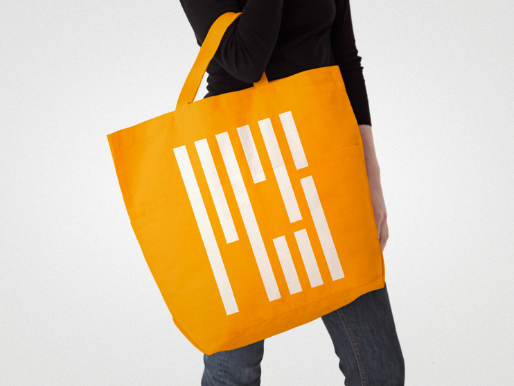
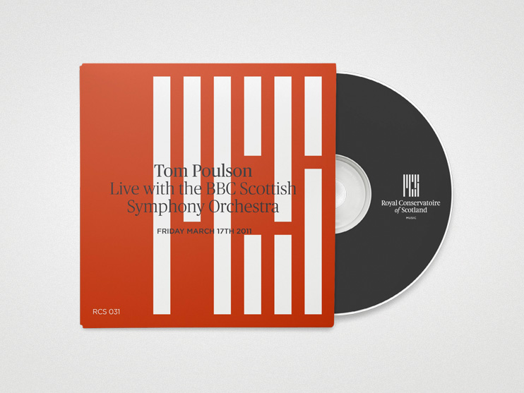
The final marque is a vertical representation of these multi-track lanes, forming the letters R, C and S. This is intentionally discreet. The grid also represents Glasgow — the Conservatoire's home. Customised serif typography was chosen to balance and soften the geometric nature of the graphic and this sans/serif interplay is applied throughout the brand literature.
— Stand blog post
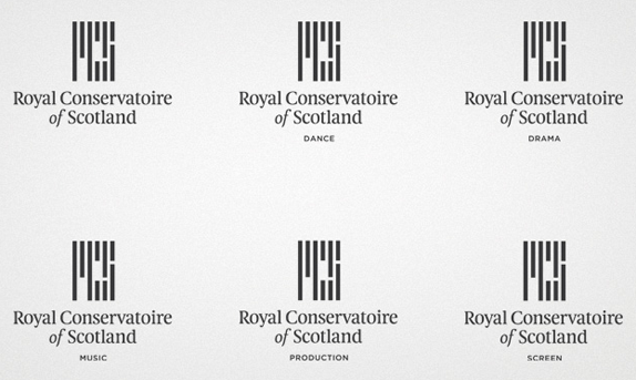
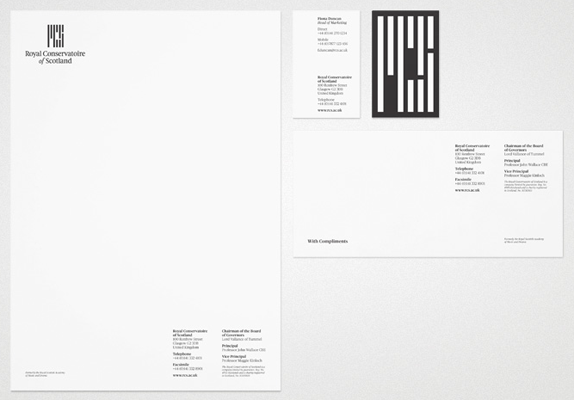
If the old logo would have had more words it would have probably thrown in a typewriter font, a bold weight, and perhaps a condensed style just for the sake of it; that was one unfortunately typeset logo. The new one, by contrast is a lovely typographic exploration in both its monogram and full name wordmark. The monogram has a really nice texture with its even spacing and manages to communicate a certain sense of rhythm although it might be a little too strict, constricting, and counterproductive to representing programs like ballet or musical theatre which would demand something looser and more emotional. But the condensed serif underneath adds a welcome balance of a more classic and refined aesthetic. It's hard not to compare this logo with that of MIT and MIT Press, but I would definitely not peg it as a copycat, as RCS's seems well concepted and operating with an audience a few degrees of interest removed from the venerable nerd institution. Overall, a great redesign.