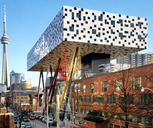
Founded in 1876, OCAD University is Canada's largest art and design institution, located in Toronto, Ontario. Formerly known as Ontario College of Art and Design, the school changed its name in 2007 to OCAD University when it received degree-granting status. Despite the 'C' in the name still standing for 'College' the acronym was kept as it had substantial equity and recognition. In 2004, OCAD University moved into its new campus, a radical structure designed by Alsop Architects that looks like a cross between a crossword puzzle and those super tall robots from War of the Worlds, with some color sprinkled for good measure. It may sound like a jab at the building, but the thing is truly jaw-dropping when you are standing below it. Anyway. Last night, at the 96th Annual Graduate Exhibition, the school unveiled a new identity, created by Toronto-based Bruce Mau Design (BMD), as well as another slight name change, to OCAD U.

OCAD U's building, designed by Alsop.
Inspired by OCAD U's iconic and transformational Alsop-designed Sharp Centre for Design, BMD created a base of black and white pixel "windows" — modular frames to hold actual student art and design work. Through these 'windows' the core of OCAD U is presented — conceptually strong, relevant, diverse, and compelling. "As we push the boundaries of art and design practice, education and research, so too does our new identity, giving the world a window into what we do here," said Dr. Diamond.
The identity is dynamic and modular in design. Every year, graduating student medal winners will be invited to design a logo within the basic window framework, providing the university with a set of logos for that year. As OCAD U grows and matures, a living library of identities will emerge, recording the ideas and aesthetics that have shaped our culture over time.
— Press Release
Brand introduction video by BMD.

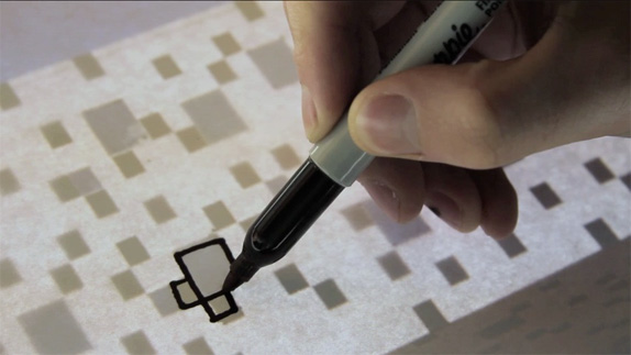
A key frame from the animation above, showing that the logo comes from the pattern on the building

Alternate lock-ups.

Logo with student's work.
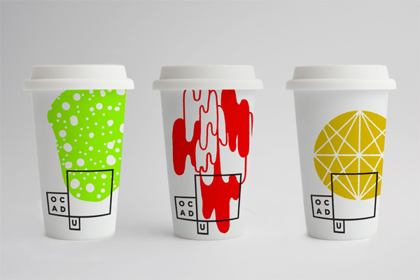
The old logo wasn't anything too exciting, just the name of the institution set in Jonathan Barnbrook's Priori inside a rectangle with the letters cropped off on both sides. Decent. But lame. And it could have any name, of any school, from anywhere in the world. The new logo draws its basic structure from the black and white square pattern on the building, giving it a delightful relevance and reason for being. The big square acts as a 'window', a concept that gets thrown around a lot and hard to improve upon but I think this identity is able to offer a slight variation on the theme by not just populating the inside of the square but having some fun with it and letting the odd 'things' come in front, behind, and all around the main square. It's almost like a cross between the visual diversity of the Aol. work and National Geographic's and Time's idea of the color frame capturing a moment in time. The idea of putting student work in there is the exact kind of conceptual move that makes the difference between students and alumni hating a redesign of their beloved educational institution or loving it. I bet we won't be seeing any petitions to get rid of this logo.
Groovy paper cups, above, and stationery, below.


